

Yay Knafeh Brand and Packaging
Problem: Develop brand to launch first product for client. Additionally, Knafeh is passionately enjoyed across worldwide cultures, The client felt this Knafeh should bring people together. The client sought to leverage their Knafeh to promote kindness = enabling easier access to shared enjoyment, between more people.
Process: Research, strategy development, product naming, design system development, packaging design, and asset production
Solution: Based on both secondary social listening research and primary ethnography the name helped clarify the pronunciation of the original Mediterranean delicacy to an unfamiliar Casual Foodie (U.S.) audience. The name, design system and assets leverage kindness, taste, comfort and excitement providing a positive approach vs. conflict about the Knafeh origin.
Initial Results: Yay Knafeh was immediately embraced at 2 grocery stores with packaging and social media support. Initial orders were sold out in 24-48 hours without couponing, sampling or retail displays. Initial grocery customers put in new orders, partnerships are building , and production expansion scaled in the first week.
Contribution: Kindle Point lead research, naming , design system development, packaging design and produced photoshoot including a food photographer and stylist.
Brand and Packaging Design
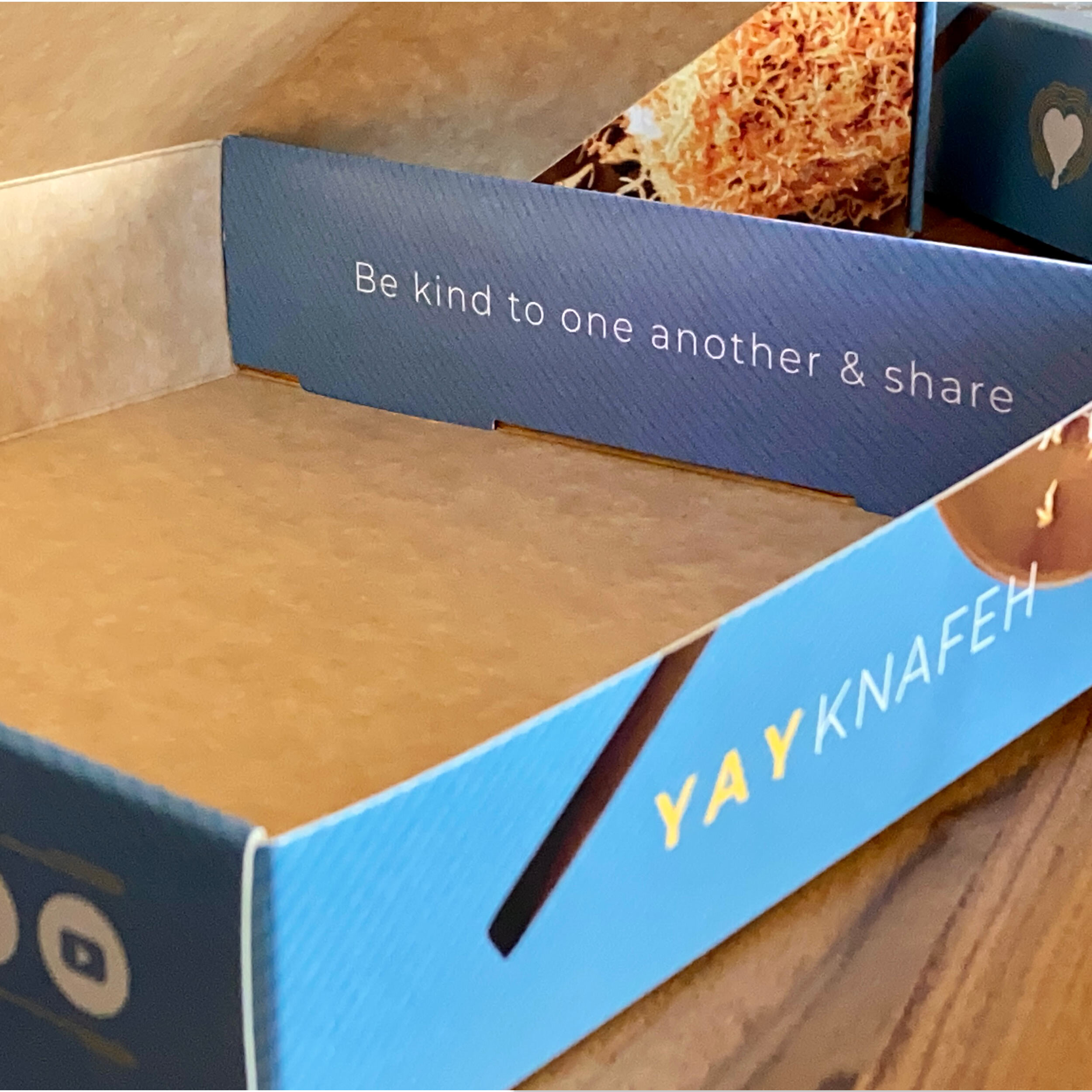
The brand aims to respect Knafeh’s true origin and people’s passions for it. Since it is so popular in Middle Eastern and Mediterranean cultures, it has often caused waves of political jockeying so we created a brand that celebrates Yay Knafeh and is more about the invitation to enjoy it… After all, outside the U.S. – Knafeh is possibly one of the world’s most enjoyed desserts.


Semiotics
The Yay Knafeh logo combined references to the key crisp phyllo dough topping the gooey cheesy center of the Yay Knafeh. The two ingredients hugging together around the warm heart center aligned with audience sentiments from your social listening and tasting ethnography. Colors helped blend tradition of Mediterranean origin with the warm happiness of yellow and bronze. The continuous line pattern embraced the full packaging - the flow – represents the creative adaptability with various pairings as well as the thin shreds of the Phyllo dough topping and the approachable nature of the product.


Copy and Tone
With a focus on taste appeal and kindness, copy and tone reflect many opportunities within the branded hashtag #sayyayknafeh as an invitation to enjoy Yay Knafeh and have fun enjoying as a shared experience with others.

Tasting Ethnography and Packaging Research
To inform the branding development I conducted tasting research which included kids, women and men to understand their entertainment habits, dessert experience, and what they thought of the product, pre-brand.
What we heard: Casual Foodies enjoy meal planning and grocery shopping because it gives them an opportunity to create and receive joy from great tasting meals they create themselves. Casual foodies enjoy unique dishes and cuisine from other parts of the world that expand their weekly meal options, but do not require extensive time to prepare. It is also important that Casual foodies discover new options that can bring joy to the table at mealtime. They are happy to share their discoveries with others as well. Longer term, they enjoy embellishing/building on a trusted mealtime winner with their personal taste or style to revitalize dining options or reduce boredom.
Regarding the product key themes came up around comfort, delicious taste without being overwhelming. warmth, great to share and entertain with friends, or around Holidays.
Packaging a new product - Quality, value, easy access and presentation were criteria for developing the packaging


Photography
Partnering with Photographer Peter Wagner and Food Stylist, Kim Loughlin, we created elegant images for packaging that easily transitioned into social media and digital applications as well to aid product launch, promotion and community building. Images were created to provide a first-person view and enhance anticipation of eating Yay Knafeh.


